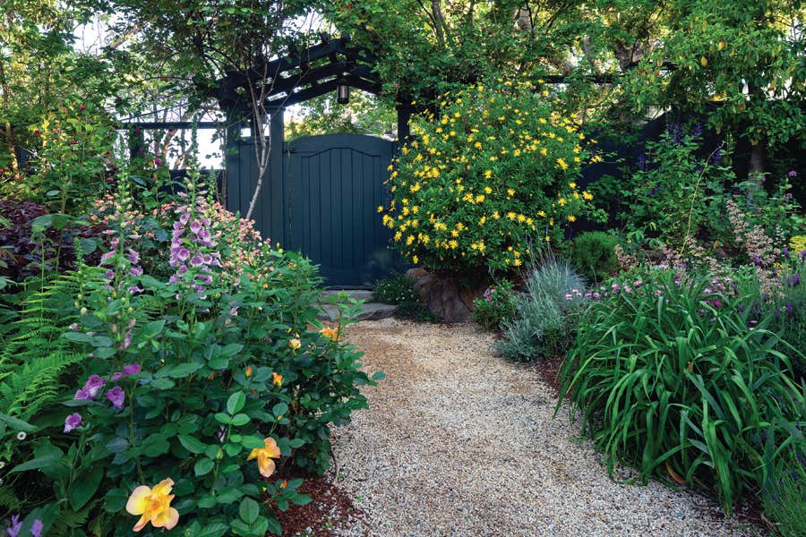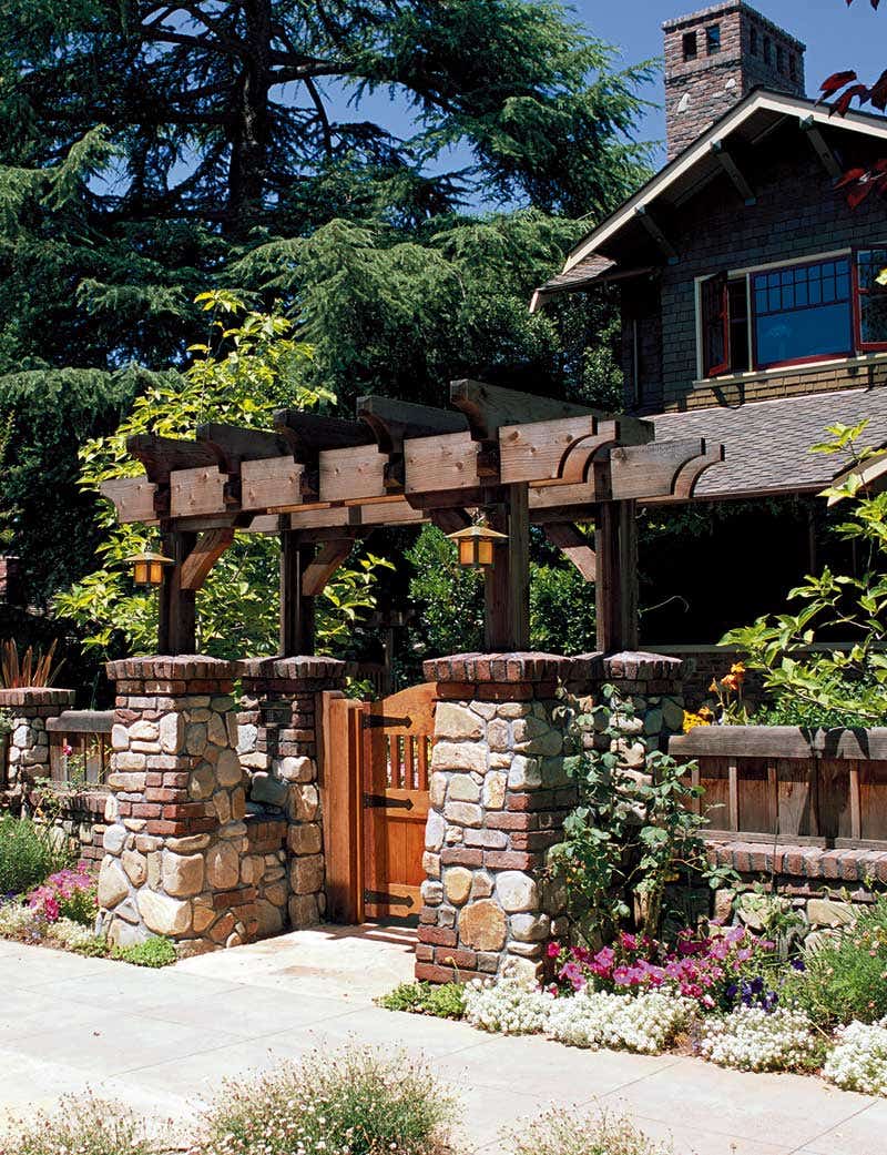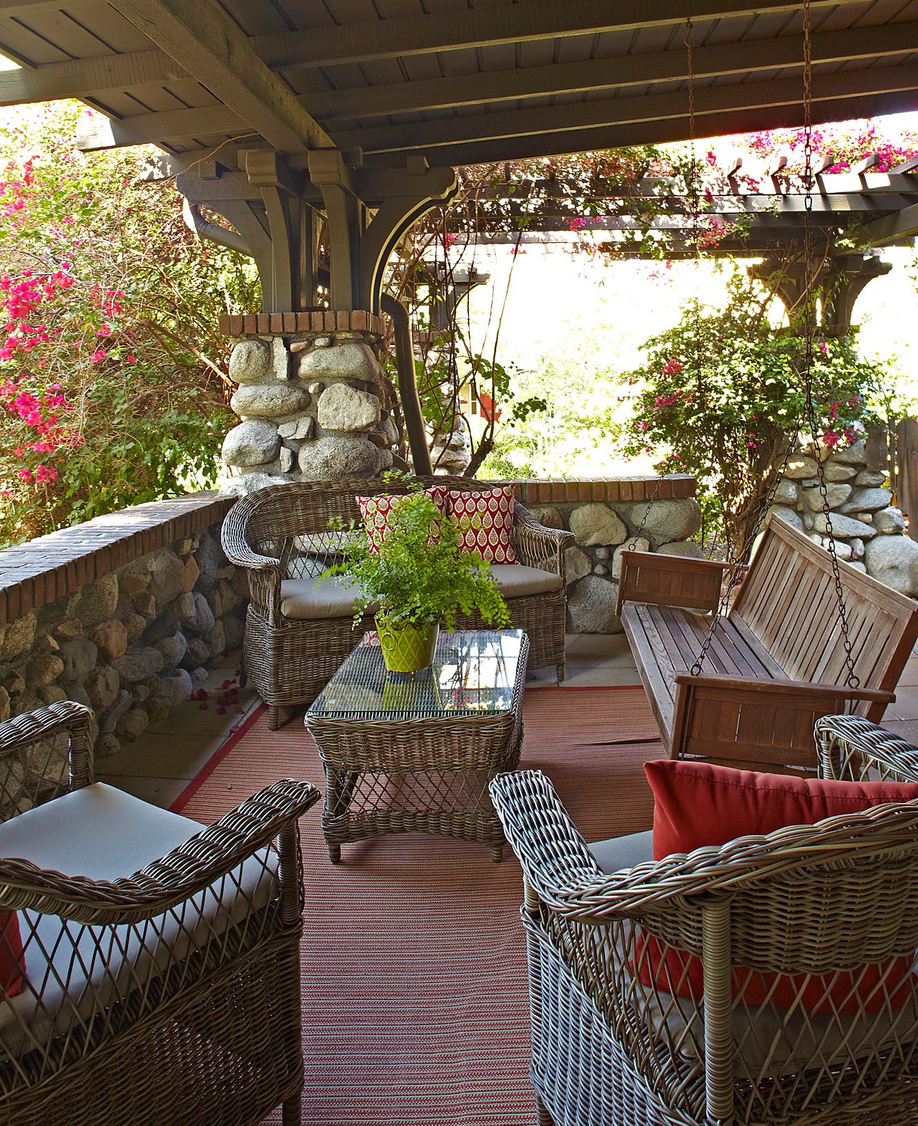
Exterior Color Schemes
The concept of “architectural colors” involves selecting, then placing, appropriate colors to reveal and enhance the logic of a building. Here are one expert’s suggestions for pleasing, historical color schemes.
Sometimes it’s difficult to see the charms of the simple buildings of the Arts & Crafts era, soaked as they often are in thoughtless comfort colors: vanilla pudding, oatmeal, untoasted beige. Only when you select and correctly place different hues and shades can paint bring out the architectural logic of these homes.
My documented source is an 1887 collection of 116 colors published for Master Painters, a thriving 19th-century trade organization of professional painters out of which evolved today’s PDCA (Painting and Decorating Contractors of America). Master Painter Colors are classics, because all of them are alive and well in the current color selector of your local Sherwin-Williams store. These are far more than a supplement to S-W’s Preservation Palette. They significantly expand lighter and darker historical color options, which actual Master Painters used without fear of stepping outside the “historic” range, and which will maximize architectural beauty.
None of the Master Painter Colors exists in isolation, because each one is related to six other lighter or darker colors on each strip. For example: Today’s popular Portabello [SW 6102] on Strip No. 15 is selected for the upper body of the Craftsman Villa, along with three lighter or darker options from the same strip. Each of the seven colors on a strip was a Master Painter Color in 1887, and all of them are bona fide classic colors today. S-W makes it easy and inexpensive to test-drive color via its $5-per-quart Color-To-Go. However, never test-drive colors directly on your walls. Instead, make large brush-outs on portable poster-board for viewing in several locations and lighting conditions.
I hope these expanded options will reduce your anxiety when selecting colors and help you expose what makes your Arts & Crafts home special. Although I’m an “ex-spurt” (when I was a graduate student, a grande dame at the Winterthur Museum told me that means “a has-been drip under pressure”), I’m comfortable with homeowners altering my color suggestions if their house, which is incapable of defending itself, is the beneficiary.
Three Classic Types
Colors are all from Sherwin-Williams Master Painter Colors, which you can view at your local store. Or upload a photo and play online with the Sherwin-Willliams Color Visualizer. Note: To help you find specified colors in your Sherwin-Williams store, collect the following strips: 1, 10, 15, 17, 26, 47, 49, 63, 69, 96, 108, and F. You can, of course, try to match the colors to those in other paint lines.
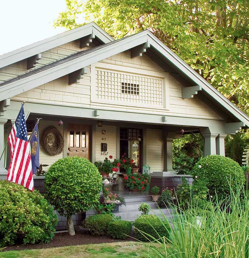
COTTAGE BUNGALOW
This delightful bungalow, with clapboards down and shingles up, requires a double-body color scheme to expose its architectural logic. The sloped sides of its brick piers appear deeply rooted, and their virility is conveyed upward through the wood pillars. The broad eaves, with their exposed rafter tails (see detail) and upward flare, reveal an Arts & Crafts fondness for Japanese vernacular houses, associated with California bungalows. A fun feature of the porch floor is its exposed mini-piazzas, suitable for locations with little rainfall. Planter boxes are placed to prevent intoxicated guests from stepping off the ends. I’ve selected colors reminiscent of the Southwest, the Caribbean, and Spanish Colonial Revival.
TRY THESE:
First-floor clapboards and ceilings of the eaves (see detail): Watery [SW 6478] or Drizzle [SW 6479]
Shingles in gable: Persimmon [SW 6339] or Baked Clay [SW 6340]
Cornices (except ceilings of eaves), exposed rafter tails (see detail), corner boards, window casings, planter boxes: Green Bay [SW 6481] or Cape Verde [SW 6482]
Foundation, pillars, stairs, floor, entry-door casing: Mega Greige [SW 7031] or Warm Stone [SW 7032]
Brick piers, entry door: Fireweed [SW 6328]
Porch ceiling: Spun Sugar [SW 6337] or Warming Peach [SW 6338]
ARTISTIC FOURSQUARE: A CRAFTSMAN VILLA
Houses like these of the early 20th century are a survival, or revival, of the neoclassical and Victorian-period Italian Villa form. A pyramidal hipped roof is essential to what was called, in its own time, a “Square-Type House.” This high-waisted version—with the second floor sills and lintels captured by the belt course and cornice—was popularly called a “Shirtwaist House,” especially in the Midwest. With clapboards divided by this belt course, the house begs for a double-body color scheme to emphasize horizontality. Its signature Craftsman detail: extended rafter tails that apparently support the eaves.
TRY THESE:
First-story clapboards: a Colonial yellow, either Sunrise [SW 6668] or Afterglow [SW 6667]
Second-story clapboards and entry door: Portabello [SW 6102] or Sands of Time [SW 6101]
Cornices (except ceilings of eaves), rafter tails, corner boards, foundation boards, belt course, window casings, hand and foot rails: Courtyard [SW 6440] or Greenfield [SW 6439]
Ceilings of the eaves, window sash, balusters of the railing: Haven [SW 6437] or Bonsai Tint [SW 6436]
Foundation, stone piers, stairs and floor, pillars, entry-door casing: Kaffee [SW 6104] or Tea Chest [SW 6103]
Porch ceiling: Refresh [SW 6751] or
Waterfall [SW 6750]
OLD ENGLISH HOMESTEAD
The house is actually a classic front-gable box with an enclosed side porch—converted into an English or Tudor homestead by the use of “ski jump” raking cornices and a steep roof. The off-center placement of the stuccoed exterior chimney and vestibule entrance creates picturesque asymmetry, despite the conventional placement of windows. To aid its architectural logic, I selected colors and placements to convey the Arts & Crafts concept that this house is in and of the ground; it’s especially important to choose a mid-tone shingle color. Instead of the common brown, long classic but now reviled, I’ve selected an “oldy moldy” sage green for the shingles.
TRY THESE:
Shingles: Artichoke [SW 6179] or Clary Sage [SW 6178]
Stucco chimney and vestibule entrance: Mink [SW 6004]
Windows: Bagel [SW 6114] or Interactive Cream [SW SW 6113]
Accents, including entry door, chimney cap, “S” hip-chimney and terra-cotta panel: Fireweed [SW 6328]
Cornices: Secret Garden [SW 6181]
OR THESE:
The colors could be reversed to “convert” the shingles into English clay tiles. Shingles: Totally Tan [SW 6115] or Bagel [SW 6114], Windows: Artichoke [SW 6179] or Clary Sage [SW 6178], Chimney and vestibule walls: Mocha [SW 6067] or Sand Trap [SW 6066], Accents: Fireweed [SW 6328].
John Crosby Freeman, aka The Color Doctor, lives in Norristown, Pennsylvania, but writes color prescriptions for interiors and exteriors nationwide. Contact him through oldhouseauthority.com.
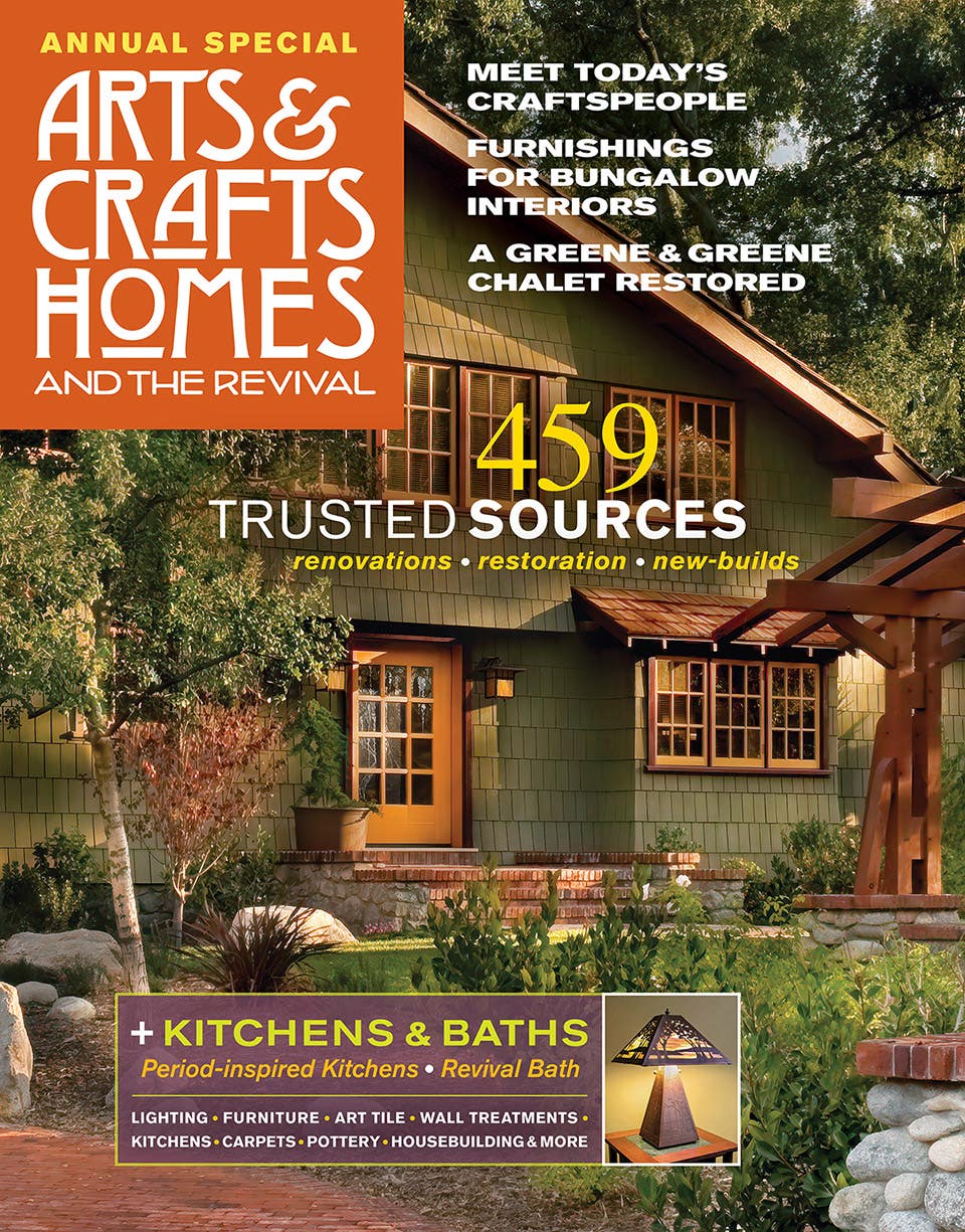
Arts & Crafts Homes and the Revival covers both the original movement and the ongoing revival, providing insight for restoration, kitchen renovation, updates, and new construction. Find sources for kitchen and bath, carpet, fine furniture and pottery, millwork, roofing, doors and windows, flooring, hardware and lighting. The Annual Resource Guide, with enhanced editorial chapters and beautiful photography, helps Arts & Crafts aficionados find the artisans and products to help them build, renovate, and decorate their bungalow, Craftsman, Prairie, Tudor Revival, or Arts & Crafts Revival home.