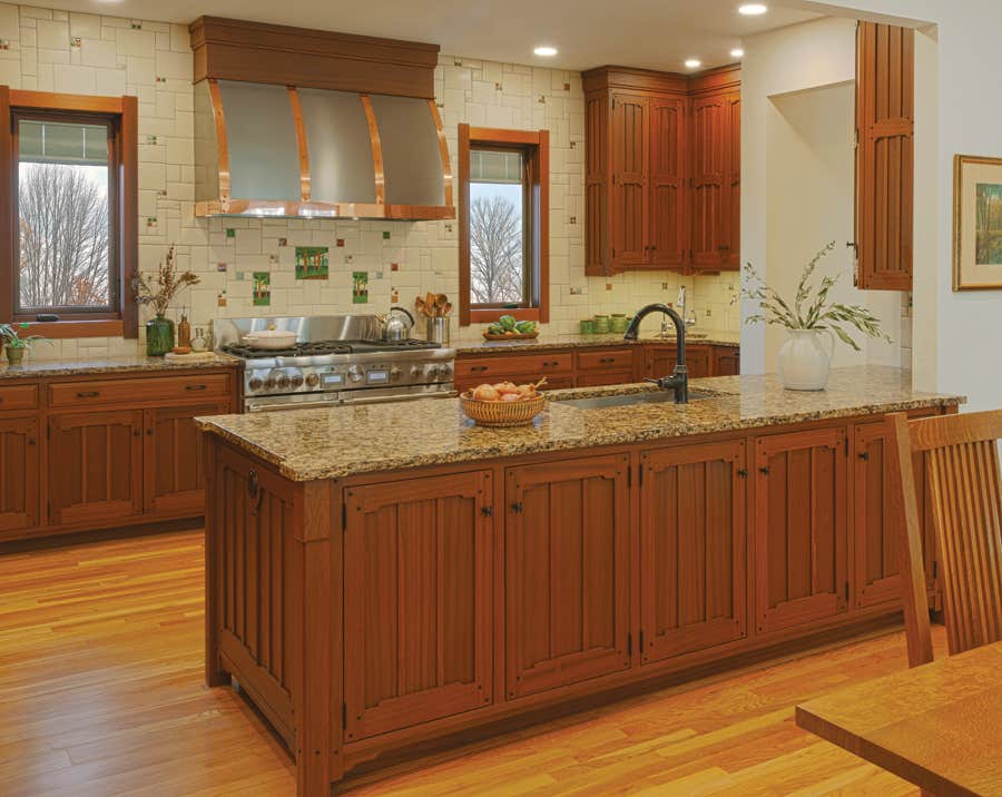
Backsplash Progression
The love affair with tile goes back more than a century for Arts & Crafts kitchens.
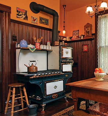
Early 20th-century kitchens were centers of innovation, equipped with such technological advances as plumbed sinks, electric ranges, iceboxes, even toasters. Walls were no exception.
As part of a cleanliness initiative known as the sanitary movement, the era’s up-and-comers preferred either plain or scored white plaster or, when they could afford it, tightly grouted, creamy white subway tile laid in a running-bond pattern, especially behind the range and any built-in worktops.
Tile also made a splash on countertops. Most early tile counters were finished in matte off-white hexagonal tile—1", 2", or 3" widths were common—or larger square tiles either laid straight or on the diagonal. As an alternative to 3" x 6" subway tile, the same or a coordinating tile pattern often continued up the wall.
By the late ’teens, colored hex tiles popped up in otherwise white installations. Soon after, tiles in pastel hues (green, yellow, blue, peach, pink, and tan) were introduced. These more colorful counters and backsplashes were typically edged with box-cap tiles on the counter and border tiles on the backsplash.
Black was a favorite for edging, as were contrasting colors. For extra pizzazz, tilesetters might add a narrow accent or feature strip in the same accent color as the edging about two-thirds of the way up the backsplash.
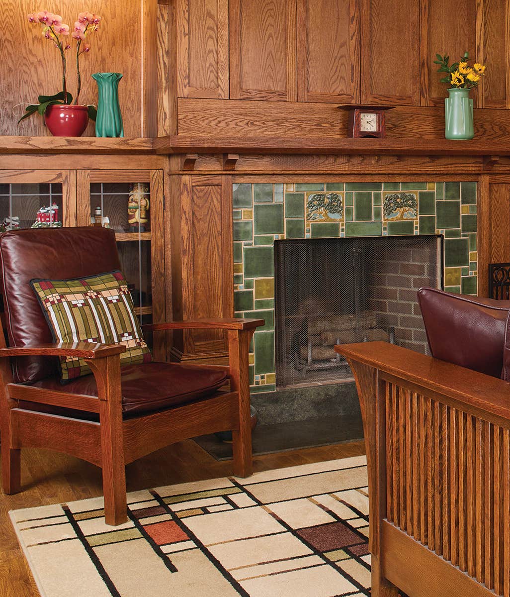
Few of these installations, of course, were done with handmade art tile. That began to change in high-style installations in the late 1920s, when the art-tile movement reached its peak—a perilously short period, given the ensuing stock-market crash of 1929. Art potteries around the country thrived, from Mercer’s Moravian Tile Works in Doylestown, Pennsylvania, to Rookwood in Cincinnati and Pewabic in Detroit (all three still working). The most diverse and vibrant of the period’s installations, though, were found in California and the West, where the tile tradition that began in Ernest Batchelder’s backyard in 1910 had exploded.
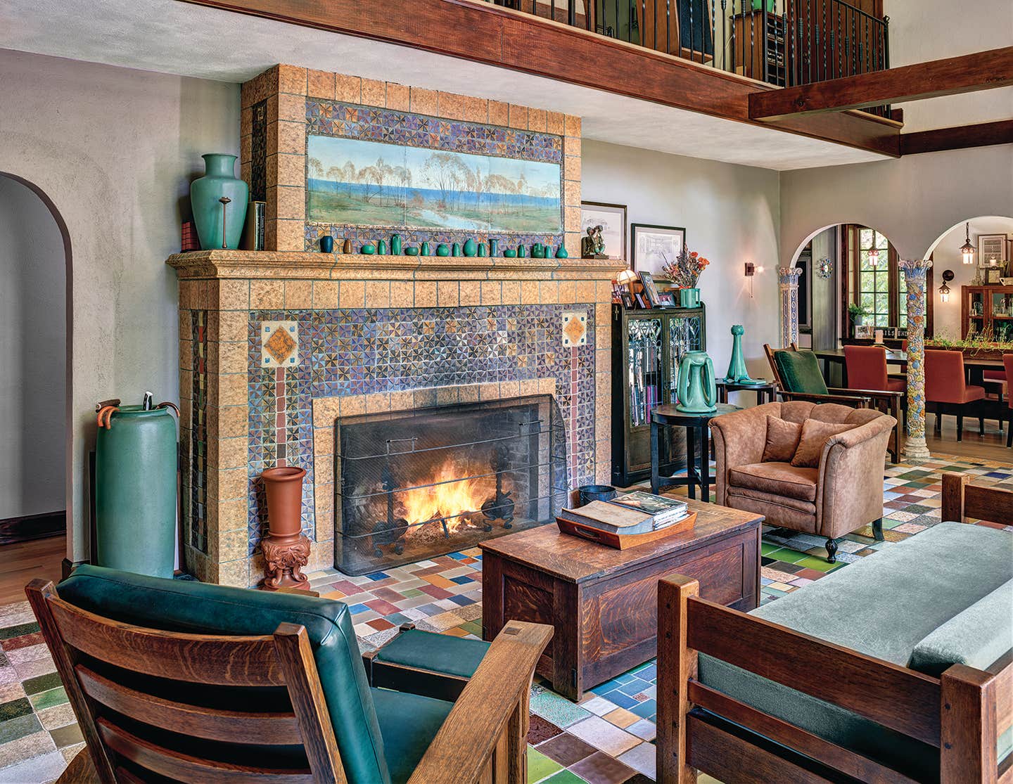
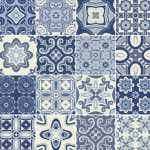
Influenced by everything from California’s Spanish Colonial past to recent discoveries of Mayan architecture, dozens of potteries turned out an astonishing array of art tile. Two distinctive looks emerged: the thick relief tiles in muted colors associated with Batchelder and the Arts & Crafts movement, and tiles in the Hispano–Moresque tradition, produced by Malibu Potteries and half a dozen others.
The signature piece of the matte and slip-glazed Batchelder genre was the scenic tile. Sometimes as large as 8" x 16", scenics were ideal centerpieces and quite naturally made excellent accents for backsplashes. In contrast, the Hispano-Moresque style was a native response to cheaper Tunisian and Spanish imports then flooding the market. Floral and geometric tiles glazed in multiple bright colors lent themselves to interlocking patterns that could cover an entire floor or wall, or act as bright accents interspersed among field tile.
While almost every historic tilemaker working in those traditions is long gone, the art tile movement of recent years arguably is making up for the loss. And just as kitchens have long since evolved from utilitarian spaces for servants to the heart of family life, the art tile produced for kitchen and bath walls today is well suited to modern lifestyles, without compromising the authenticity of the craft.
Want to create an authentic period-look tile counter and backsplash, ca. 1925, or an over-the-top Hispano–Moresque kitchen wall treatment? Native Tile & Ceramics has you covered. Or perhaps you prefer a backsplash made in the Batchelder style, with one perfect “scenic” tile as a focal point. Pasadena Craftsman Tile offers tiles slipcast from authentic Batchelder originals, as well as original designs in the same style. Still other tile makers—including those shown on these pages—continue to expand the boundaries of the movement by creating new artisanal work that’s instantly identifiable as Arts & Crafts, yet unmistakable as to maker, carrying on a tradition as old as the Arts & Crafts movement itself.
Art Tile Advocacy
As early as 1905, at least one magazine writer was advocating the use of art tile in American homes. “For the purposes of decoration it is not always essential nor even desirable that tiles be mechanically perfect,” wrote Addison Le Boutillier in the August 1905 issue of Good Housekeeping. “A little irregularity of shape and glaze which will give a variety of color tone is valuable . . . and relieves what might otherwise be a mechanical and uninteresting surface.”
Mary Ellen Polson is a creative content editor and technical writer with over 20 years experience producing heavily illustrated know how and service journalism articles, full-length books, product copy, tips, Q&As, etc., on home renovation, design, and outdoor spaces.