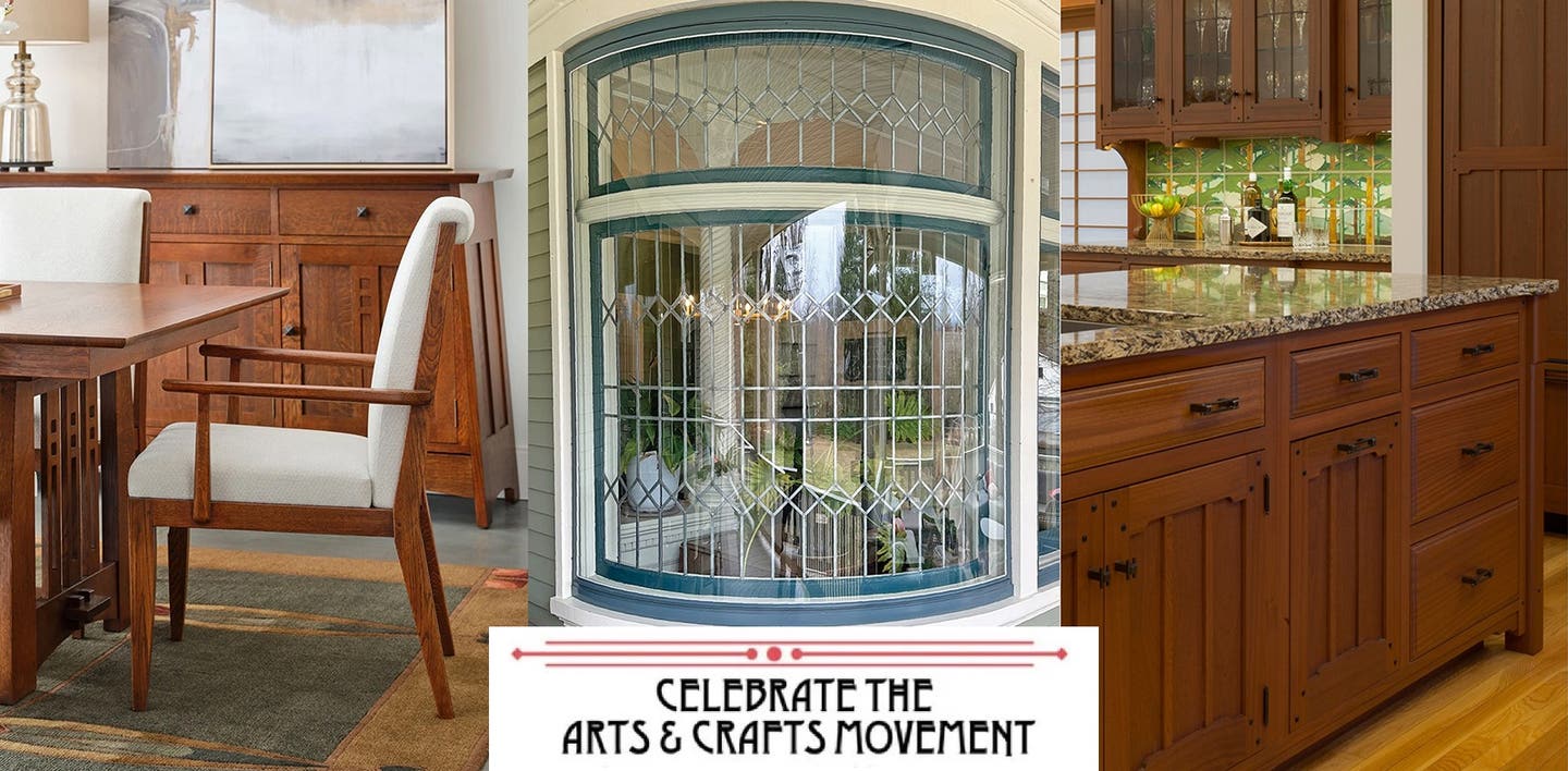

What Color?!
In this photo, I was trying to decide how to finish my bedroom, which had been a home office in prior years. The paint chips and fabric samples had been pinned to the walls for quite some time. I’d bought a flat-weave rug in a Morris design, you see, colored red and green.
A Note from the Editor:
Ceilings in my house were relatively easy: They’d once been covered in beaded boards, in the usual manner of a summer “cottage,” and I let that be my cue. Now they are clad in wide boards milled in fir and finished with orange shellac, like the originals.
Paint and wallpaper were more difficult. In this photo, I was trying to decide what to do in my bedroom, which had been a home office in prior years. The paint chips and fabric samples had been pinned to the walls for quite some time. I’d bought a flat-weave rug in a Morris design, you see, colored red and green. I ordered wallpaper samples, looking for a true green—“an English green” was how I thought about it. But my favored samples looked awful in the room, and the one or two papers that looked good taped to the wall leaned inexplicably toward blue. Frustrated, I brought fistfuls of color cards home from the paint store—chartreuse and apple green, historically muted greens, even creeping up on teal. The rug seemed to reject everything.
About that time I realized I had inadvertently embarked on a complementary color scheme, green and red being opposites on the color wheel. Complementary schemes are harder to get right than monochromatic and analogous schemes. (Analogous schemes use colors contiguous on the wheel; say, red-violet, purple, and deep blue.) My confidence shaken, I put white sheets on the bed while I thought about it. Time passed.
Subscribe to Arts & Crafts Homes, or pick up an issue at your favorite bookstore or newsstand. Order back issues through the Old-House Bookstore or call (800) 850-7279.
One rainy day, I pulled out a few color-theory books for inspiration (or for something to copy). “Red and green, good grief,” I thought, trying in vain to apply what I was reading. “What, was I looking for Christmas year-round?” The thing is, there’s nothing remotely Christmasy about the rug . . . . Aha! a discussion of the split complementary—a scheme that uses one color along with the two colors on either side of its complement. Applied to my room, that might mean red with blue-green and yellow-green. I looked at the rug again. Its one red is a somewhat subdued shade tending toward the blue end. The “green,” on closer examination, consists of a deep blue-green ground with ornamentation in various soft blue-greens and yellow-greens.
I saw now that the leftover wall color—a dull bisquey yellow—was actively fighting the rug. And almost instantly, I understood why the bluish papers that “shouldn’t have worked” did—and I had my perfect green wall color.
Patricia Poore,Editor
ppoore@homebuyerpubs.com
10 Harbor Rd., Gloucester, MA 01930
Patricia Poore is Editor-in-chief of Old House Journal and Arts & Crafts Homes, as well as editorial director at Active Interest Media’s Home Group, overseeing New Old House, Traditional Building, and special-interest publications.
Poore joined Old House Journal when it was a Brooklyn-brownstoner newsletter in the late 1970s. She became owner and publisher and, except for the years 2002–2013, has been its editor. Poore founded the magazines Old-House Interiors (1995–2013) and Early Homes (2004–2017); their content is now available online and folded into Old-House Journal’s wider coverage. Poore also created GARBAGE magazine (1989–1994), the first unaffiliated environmental consumer magazine.
Poore has participated, hands-on, in several restorations, including her own homes: a 1911 brownstone in Park Slope, Brooklyn, and a 1904 Tudor–Shingle Style house in Gloucester, Massachusetts, where she brought up her boys and their wonderful dogs.