Wallpaper and Paint—how the twain shall meet
How do you choose wallpaper that “goes with” the paint, or vice versa? Experts lend advice on getting patterned wallcoverings and trim colors to coexist for maximum effect.
Taking our cue from a reader question about how to choose trim color that “goes with” the wallpaper, we spoke to wallpaper experts, colorists, and designers. I’ve been surprised at how much interest there is in the topic, and how much effusive advice was offered.
It’s not a new dilemma. William Morris (who liked to give advice on this and many other topics) was a strong advocate for woodwork that does not match the wallpaper. (He often suggested that trim be painted “a quiet green.”) He felt contrast was critical: “Rooms with wood-work and walls of equal tone are sometimes very tame, and even dull.” More recently, artist and muralist C.J. Hurley echoed Morris’s sentiments, explaining that the best interiors do not have wallpapers and woodwork too “safely” coordinated. Think of your room as a musical composition, C.J. suggests—one that has a careful combination of notes arranged harmonically, but with enough dissonance to make it compelling.
Here’s an example. If you have a tripartite wall with wallpaper in the frieze (top), don’t necessarily use paint in similar colors for the fill (center) and dado (bottom). Be adventuresome! If the frieze is predominantly green, how about the wall fill in an earthy yellow and the dado below in a richer, yellow-brown that leans toward red? Create interest and a sense of movement, not flatness. A simpler bipartite Arts & Crafts scheme might have a frieze in naturalistic blue tones, with a russet orange-brown or silver-tone grey below, being sure to vary the tone (light or dark) between frieze and wall for visual relief and balance.
Color and pattern in the Victorian era were layered together for a textured palette that nonetheless was balanced to the eye, said the late wallpaper guru John Burrows. Tastemakers didn’t shy away from strong and contrasting color schemes, “scientifically” basing their choices on the color wheel. Analogous colors (say, amethyst purple and sapphire blue) or contrasting ones (hunter green and madder red) could be “pleasingly combined.” Tertiary colors produced softer, subtler tones and were popular, such as an olive-green paper accented with burgundy and gold; perhaps a dash of peacock blue would highlight the terra cotta on woodwork and trim. For a more sophisticated approach, Burrows advised using a paper’s neutral ground such as “drab” (a warm grey), tan, or putty as the base of the painted walls or woodwork, then adding one or two tertiary accents as narrow bands or stripes.
Maryellen Mantyla of California Paints reminds us that neutrals carry undertones of yellow, blue, green, or red, something to consider when deciding on complementary or harmonious colors.
Christopher Dresser’s 1859 botany textbook was titled Unity in Variety, which suggests a design concept as applicable to interiors today. Wayne Mason of Mason & Wolf Wallpapers (specialists in artistic period papers of the late-19th century and Arts & Crafts era) likes to keep Dresser’s philosophy in mind when combining wallpaper and paints, interpreting their unity in terms of music. That is, if the same red is repeated throughout the room, it’s like hitting the same key on the piano over and over. Variation produced by combining brick red with burgundy and soft rose creates the equivalent of a musical chord.
Tricks of the Trade
John Burrows had suggested using lining paper on walls, then painting trim before hanging the wallpaper. Allow the paint to overlap slightly onto the liner, so that minor gaps in the wallpaper will not be evident. Hang wallpaper last. This sequence also avoids paint splatters on the paper.
Mason often uses stenciling and painted bands of color to unify and define busy paper patterns on both walls and ceilings. For example, the transition between a ceiling painted a light sky blue and the wallpaper border surrounding it may be highlighted with a band of gold stenciling, carrying the pattern onto the painted portion of the ceiling as well as softening the hard edges of the wallpaper border.
As for painting plaster ceiling medallions, Heather Cole of Bradbury & Bradbury Wallpapers says to avoid the “paint-by-number look” by using only one color, perhaps with tonal variation or gilded highlights. She suggests glazing to add softness and glow.
“I believe in plenty of optimism and white paint,” said decorator Elsie de Wolfe as the Colonial Revival took hold. Despite her famously successful use of white paint, it takes skill to use white, warns David Berman of Trustworth Studios. Berman specializes in design (including wallpapers) based on the work of English Arts & Crafts designer C.F.A. Voysey, who favored light- toned, airy interiors with woodwork either left natural or painted white. But “white” is relative. Berman favors Benjamin Moore’s “White Coffee” as a trim color, which is closer to a beige and has the tonality to complement tertiary colors. He claims that a common mistake is trying to “brighten” a room with white paint, which flattens the room and overwhelms its other elements. Berman advises that color be chosen, too, according to the light in the room, and particularly whether the room is to be used primarily in daylight or under artificial illumination. The light source dramatically alters how paint and wallpaper colors are perceived.
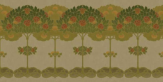
Woodwork in a room acts as the frame for its walls, says nationally recognized designer Barry Dixon. He used Morris’s ‘Apple’ wallpaper from Morris & Co. in a custom colorway for his own kitchen and adjoining breakfast nook, creating an autumn palette. Benjamin Moore’s ‘Startling Orange’ joins three colors by Farrow & Ball: ‘Cream’, the warm-brown ‘Wainscot’, and ‘India Yellow’ (a color that in the 18th century was made from the bright-yellow urine of cows fed mango leaves). Inspired by Lutyens’s Castle Drogo in England, Dixon limed and waxed the quarter-sawn oak banquette to create a quiet frame for the richly colored Morris wallpaper.
Brian D. Coleman, M.D., is the West Coast editor for Arts & Crafts Homes and Old House Journal magazines, our foremost scout and stylist, and has authored over 20 books on home design.


