Using Interior Color Palettes for Arts & Crafts Homes
Use color palettes, stencils, frieze papers, textiles, and tile to can add color to your Arts & Crafts home, informed by period conventions and your personal taste.
Color advice for Arts & Crafts-era houses, most of it focused on exteriors, is downright hackneyed: “use natural earth colors in mid to dark tones.” There’s more to creating a pleasing, compatible interior color palette. A review of period wallpapers, surviving interiors, and advice given by Arts & Crafts taste-makers turns up pale stone colors, eggplant (and lilac), even luridly colored patterns. There’s the matter of analogous vs. complementary schemes, both of them popular but with very different results. (Analogous refers to colors adjacent on the color wheel: dark pumpkin walls with fir or red-oak woodwork, for example; complementary means opposite—using green or blue with red-tinged wood.)
Stencils and frieze papers, textiles, and tile all can add color. The schemes that follow should get you started on a direction, informed by period conventions and your own personal taste.
WHERE TO BEGIN
Context is everything. Remember that in this era of improved gaslight and early electricity, rooms were no longer dark. Welcome sunlight was filtered by only a roller shade or a simple curtain. Interior color palettes changed with the light. (On a related note, you’ll want to consider whether the room gets cool north light or hot west-facing light, and also what time of day the room is used most. A bedroom or dining room used chiefly at night should be painted a color compatible with artificial lighting.)
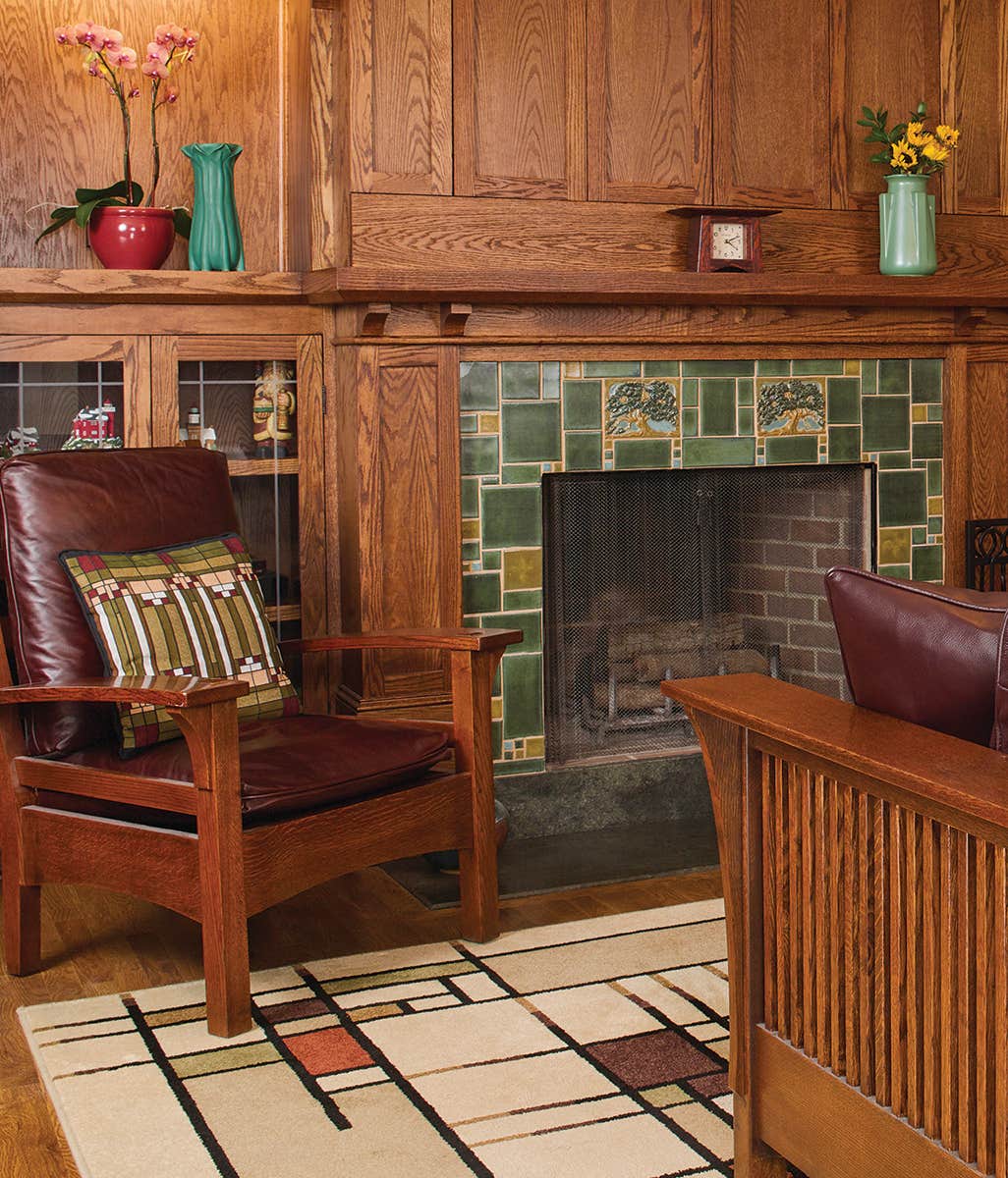
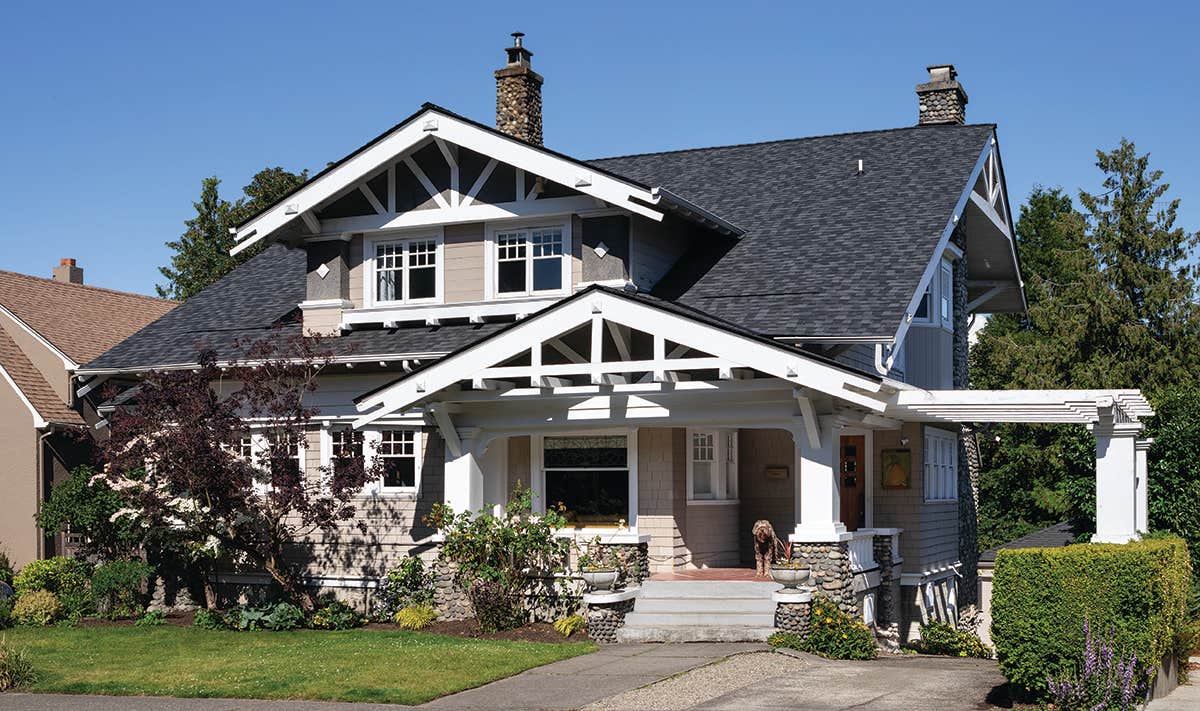
Whether it’s brown-stained oak or Douglas fir finished in orange shellac, wood certainly sets the context for color palettes in bungalows and other Arts & Crafts houses. River rocks or fireplace tiles add another given. These considerations are a start, whether you choose a wall color to pick up on or complement them. The usual decorators’ advice to “start with the carpet” is not a bad approach. An Arts & Crafts rug in a period colorway provides pre-selected options. Even if you’re using a traditional Turkish or Persian carpet, you’ll discover it’s easier to find a compatible paint color than to find the right carpet once the paint is dry.
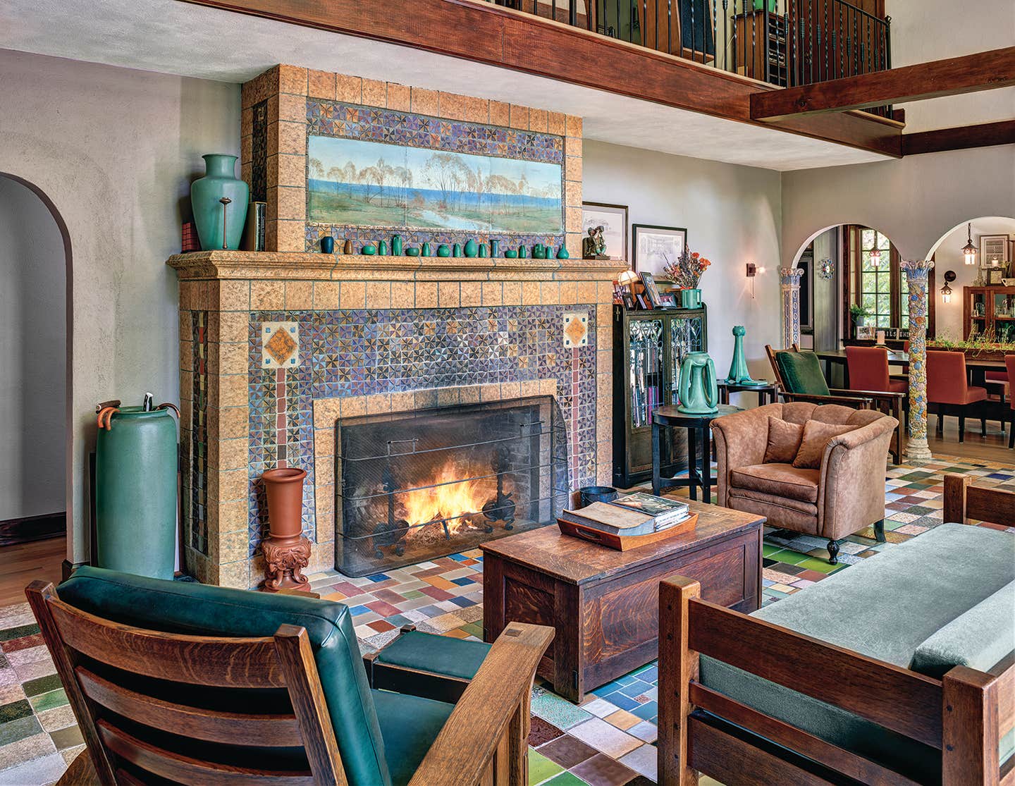
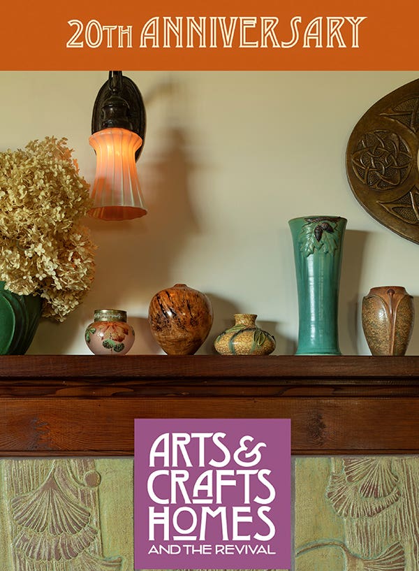
If your house has stained glass, that’s another cue for a color palette. So is a collection of Arts & Crafts pottery, a plein-air painting, or a textile.
THE NATURAL CHOICE
Here it is, the familiar advice to look to nature—especially valid for Arts & Crafts houses, but pleasing and generally safe in all periods. Earth tones are often thought to be neutrals, as with stony tans and flinty blues. “Vegetable colors” were very popular, however, and these include Hubbard-squash orange and zucchini green. Greyish sage green was used, but greens with a yellow undertone were more popular by far. The Arts & Crafts palette has been called an autumn palette: warm tones naturally go with all the wood trim and furniture of the period. Walls were generally done in a mid-range value, in colors with a muted (natural!) quality. So choose ochre rather than colonial yellow, brick instead of true red.
As for lighter tones, think dusky rather than pastel. On walls and ceilings, stay close to flat or matte as a surface finish. Satin-finish or semi-gloss is reserved for trim, and for service rooms.
EMBELLISHMENTS
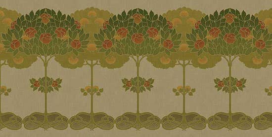
Treatments were simpler than they had been in the 19th century—typically, walls were painted in one color, occasionally overlaid with a subtle glazed and sponged, dragged, or stippled texture, but never glossy. Stripes and striped wallpaper were in evidence. The frieze over a high wainscot was often decorated. The narrow frieze over a picture rail would be painted to coordinate with either the wall or the ceiling, and it might be stenciled—subtly, sometimes in just one color. Natural but stylized motifs were very popular: ginkgo leaves, pinecones, acorns. So were abstracted and geometric designs adapted from the era’s art movements.
CONSIDER THE ROOM
Public rooms (living room and dining room) had the more robust color palettes and embellishments, while family areas were kept simple. The new open plan of these houses—with just a colonnade separating the main rooms—suggest that schemes flow from space to space. That might mean tonal variation on a single hue, or two rooms done in complementary colors of similar intensity. The psychology of color was already discussed a hundred years ago, with familiar advice: blues for restful bedrooms, greens for calm, convivial spaces, hot colors to stimulate appetite in the dining room.
NOT ALL WHITE
It may seem like a paradox, but it’s actually color, not white paint, that shows off naturally finished woodwork. The darker the wood, the more you should avoid white paint and the high contrast it brings.
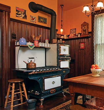
That said, neutrals and even greyed pastels have always been used in Arts & Crafts interiors. Lighter colors were popular for sun-drenched rooms, and alongside light woods, and for houses that blended Craftsman and Colonial Revival motifs. Lighter colors often were preferred for bedrooms and certainly for service rooms.
Still, “white” didn’t mean white as our postmodern eyes see it. A recommendation for “white” during the era may have meant pale grey, coffee with cream, beige, even a buff yellow. Look at the photos here and see that the paler colors on walls still read as quite different from a sheet of white paper. A good bit of general advice is to stay away from high-contrast schemes.
Patricia Poore is Editor-in-chief of Old House Journal and Arts & Crafts Homes, as well as editorial director at Active Interest Media’s Home Group, overseeing New Old House, Traditional Building, and special-interest publications.
Poore joined Old House Journal when it was a Brooklyn-brownstoner newsletter in the late 1970s. She became owner and publisher and, except for the years 2002–2013, has been its editor. Poore founded the magazines Old-House Interiors (1995–2013) and Early Homes (2004–2017); their content is now available online and folded into Old-House Journal’s wider coverage. Poore also created GARBAGE magazine (1989–1994), the first unaffiliated environmental consumer magazine.
Poore has participated, hands-on, in several restorations, including her own homes: a 1911 brownstone in Park Slope, Brooklyn, and a 1904 Tudor–Shingle Style house in Gloucester, Massachusetts, where she brought up her boys and their wonderful dogs.