Exterior Paint Schemes for Foursquares
Proper placement of color breaks will restore your Foursquare’s architectural integrity.
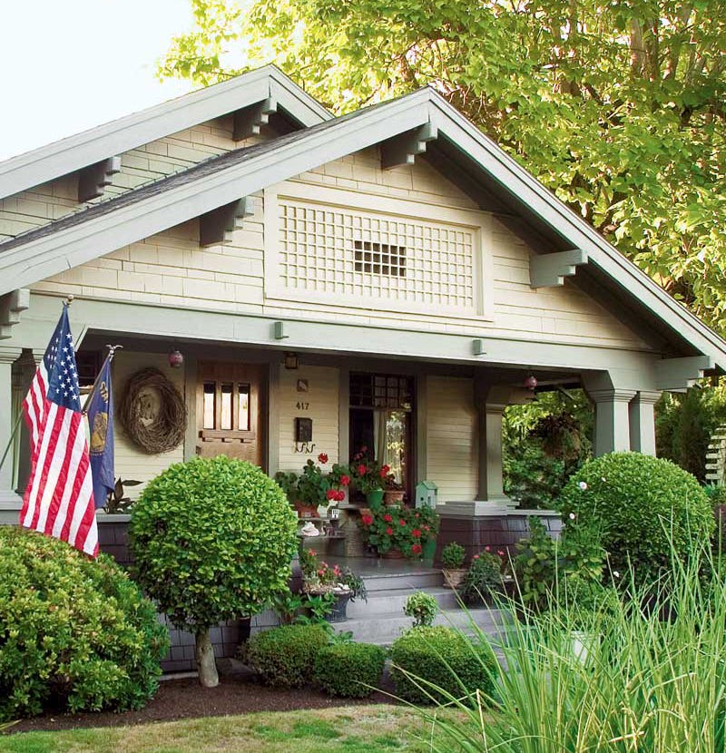
This house type of the first quarter of the 20th century is a common one. Though some examples are grand, the American Foursquare is more often straightforward, a square box neatly placed in an early suburb. It’s easy to overlook the period appeal of such a house if it’s painted in a lazy scheme—or worse, slathered in white from top to bottom. But you can bring back its glory with a little thought to paint colors. Good placement of color breaks will restore its architectural integrity.
The bungalows and Tudors that are Foursquare contemporaries are relatively easy to color. Bungalows are best in earthy or grayed tones; upright Tudors are often brick or done up in brown-and-putty half timbering. The Foursquare is more like a coloring-book house, its big square walls a blank canvas.
Complicating matters, “foursquare” is more a type than a style, even as they were built during this period. A Foursquare can have Craftsman elements; it may look rather like an Arts & Crafts “bungalow in a box.” Others have decidedly Prairie School-derived rooflines, porches, belt courses, and ornaments. Then again, many are “Free Classic” in style or have Colonial Revival elements, like round porch columns.
Let’s do a quick review of opportunities for color placement. Consider five basic breaks:
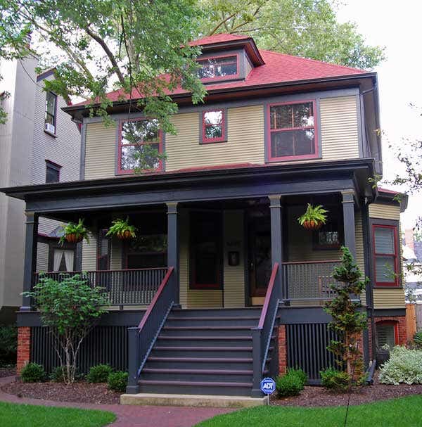
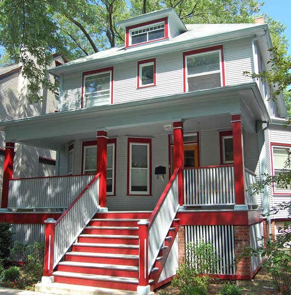
Body is the main color used on clapboards, shingles, or stucco. Major trim is usually painted in a contrasting color, creating an “outline” for the building. Major trim includes corner boards, gable trim boards, door and window trim, and often porch railings. Minor trim might include doors, shutters, porch parts, and decorative trim related to major trim, like brackets. Sash is the moveable part of the window. The Victorian preference for darker sash—brown, black, bottle green, and dark red—continued during the first quarter of the 20th century, even as the use of trim lighter than the body color came into fashion. Accent refers to optional colors—or tints and shades of your basic colors—used to highlight elements such as door panels and porch parts.
Not every house needs five colors. Depending on its size and ornamentation, you may choose a monochromatic scheme, or a classic three-color scheme of body, trim, and accent. Choosing tints or shades of the same color, or using just one secondary color on shutters or front door, can be elegant. Remember that having five color breaks doesn’t have to mean five different hues; the scheme can include two shades or tints of the same hue. For example, “major trim” and “minor trim” might be the same color, but in closely related shades (one darker, one lighter). The door might be done in the trim color or the sash color.
Consider “given” colors before selecting paint, including your foundation, roofing, any brick or stone, and landscape features. Look at the neighborhood, too. In general, it’s a good idea to keep it simple. Don’t use a very dark, unusual, or saturated color for the body. Don’t go overboard with accents, or “pick out” details to the point where the architecture has been reduced to a bunch of colorful but unrelated elements. And don’t think you have to pick a color you don’t like because it’s “historical.” Choose colors that please you; use their tone and placement to create a period look.
It’s hard to summarize paint colors popular in this period, as taste shifted tremendously in the years 1890 to 1940. Paint was available pre-mixed and in many color choices. The old advertising in magazines may not be typical, since kit companies and paint companies liked to present bright, cheerful houses in their ads. The truth is, some variation of gray and white was probably most common in the real world.
Color-scheme advice specific to Foursquares
1. Monochromatic paint schemes relied on the roof (often a colorful asphalt product) as the cue, or as a second color.
2. The typical homeowner used a two-color scheme: body and trim. You’ll achieve a different effect depending on whether the trim is lighter in value than the body, or vice versa. Victorian schemes favored darker trim, outlining the structure—which can have the effect of lowering the house or making it seem smaller. Later schemes favored making the trim lighter, even cream or white. This opens up the structure and can make it seem larger.
3. A stuccoed, Prairie-style Foursquare was already two-tone with cement stucco and wood trim: The cement might be tinted or painted in tan, gray, or yellow; belt courses and window trim were painted in the dark trim color.
4. Occasionally a color scheme—then or now—is chosen to highlight a particular element, such as architectural ornaments, an unusual window, or classical columns.
Whatever your colors, don’t forget to test all of them in large patches on the house, to be viewed together in changing light. Even if you’re dissatisfied with your first choices, you’ve learned where to go next: often it’s the same hue, but two shades darker and two degrees grayer!
Patricia Poore is Editor-in-chief of Old House Journal and Arts & Crafts Homes, as well as editorial director at Active Interest Media’s Home Group, overseeing New Old House, Traditional Building, and special-interest publications.
Poore joined Old House Journal when it was a Brooklyn-brownstoner newsletter in the late 1970s. She became owner and publisher and, except for the years 2002–2013, has been its editor. Poore founded the magazines Old-House Interiors (1995–2013) and Early Homes (2004–2017); their content is now available online and folded into Old-House Journal’s wider coverage. Poore also created GARBAGE magazine (1989–1994), the first unaffiliated environmental consumer magazine.
Poore has participated, hands-on, in several restorations, including her own homes: a 1911 brownstone in Park Slope, Brooklyn, and a 1904 Tudor–Shingle Style house in Gloucester, Massachusetts, where she brought up her boys and their wonderful dogs.